At STUDIO 1, we have been experts in shaping powerful brand identities since the early 1990s. We specialise in designing and managing comprehensive branding solutions for startups, established companies, and global blue-chip corporations. Based in Aberdeen, Scotland, our reach and impact extend to international markets.
Our unique approach to company branding and brand identity solutions helps businesses achieve several critical objectives:
• Stand out from competitors in crowded markets.
• Establish consumer trust and loyalty.
• Project stability and professionalism locally and globally.
Ultimately, our branding solutions ensure your online and offline marketing efforts are more effective, professional, and memorable.
The Vital Role of Brand Image and Identity
Brand image and identity are not just aesthetic choices; they are crucial, strategic assets for any company. Your brand, logo, and overall identity form the core of your marketing strategy. They serve as the visible representation of your standards, vision, and values.
Effective branding creates a clear distinction from competitors while fostering an emotional connection and strong recognition among your target audience.
Shaping External Perception and Building Trust
Branding is the essential message you communicate to the world; it dictates how consumers interact with and feel about your company. A strong brand image adds significant value to any business.
• Your greatest asset: A compelling brand fosters positive relationships with clients.
• Shared values: When clients align with your ethics and vision, they are more likely to engage with your business model and purchase your services comfortably.
A weak brand image, conversely, can be a liability that hinders growth and trust.
Achieving Instant Brand Recognition
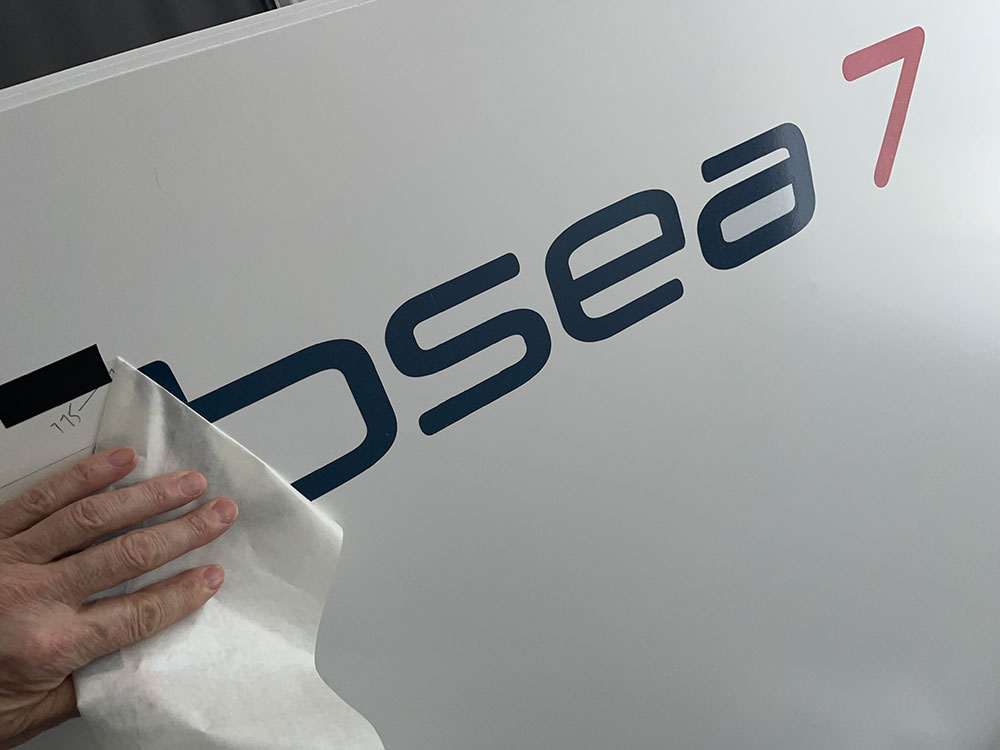
Your logo design, color scheme, and visual elements play a pivotal role in making your brand instantly recognizable. People are highly receptive to color and form.
When an audience sees your logo, they immediately engage with everything your company represents. We use this principle to help you build lasting recognition.
Case in Point: The BP Rebrand
Consider the late 1980s British Petroleum (BP) initiative. They rebranded to improve their environmental image. They shortened the name to BP and revamped the logo to reflect their commitment to environmental responsibility. The new logo featured an abstract sunflower—symbolizing the sun's energy—combined with green hues to depict environmental awareness. This successful rebranding helped BP reposition itself as a global provider of green energy solutions.
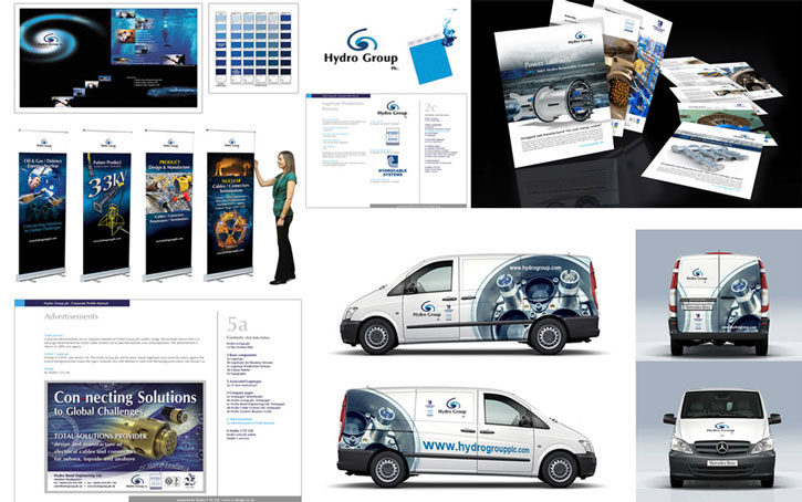
Our Core Branding Services
Your logo design, color scheme, and visual elements play a pivotal role in making your brand instantly recognizable. People are highly receptive to color and form.
• Branding Strategy
• Brand Identity Development
• Brand Standards & Guidelines
• Professional Logo Design
Ready to elevate your brand's image and identity?
Contact STUDIO 1 today and learn how we can help you create a compelling brand that resonates powerfully with your audience and achieves lasting success.